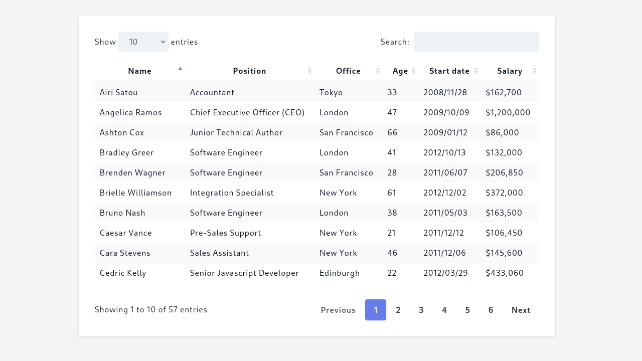
Tailwind CSS is a popular utility-first CSS framework that provides a set of pre-designed CSS classes to help you quickly build responsive and customizable user interfaces. One of the common UI components that you might need to build is a responsive table, which can be tricky to style and make it work well on different devices.
Tailwind CSS provides pre-designed classes to help you build responsive tables easily. These classes allow you to style the table header, body, and cells, as well as handle table layout and alignment. With Tailwind CSS, you can easily create a responsive table that looks great on any device and screen size.
For example, to create a basic responsive table using Tailwind CSS, you can use the following HTML code:
<div class="overflow-x-auto">
  <table class="table w-full">
    <thead>
      <tr>
        <th class="px-4 py-2">Name</th>
        <th class="px-4 py-2">Age</th>
        <th class="px-4 py-2">Email</th>
      </tr>
    </thead>
    <tbody>
      <tr>
        <td class="border px-4 py-2">John Doe</td>
        <td class="border px-4 py-2">35</td>
        <td class="border px-4 py-2">john@example.com</td>
      </tr>
      <tr>
        <td class="border px-4 py-2">Jane Doe</td>
        <td class="border px-4 py-2">28</td>
        <td class="border px-4 py-2">jane@example.com</td>
      </tr>
    </tbody>
  </table>
</div>
In this example, the table class is used to define the table, while the thead, tbody, th, and td elements are used to define the table structure. The px-4 and py-2 classes are used to set the padding of the cells, while the border class is used to add a border to the cells.
The overflow-x-auto class is used to enable horizontal scrolling on small screens when the table width exceeds the screen size.
Overall, Tailwind CSS makes it easy to build responsive tables that look great on any device and screen size.


