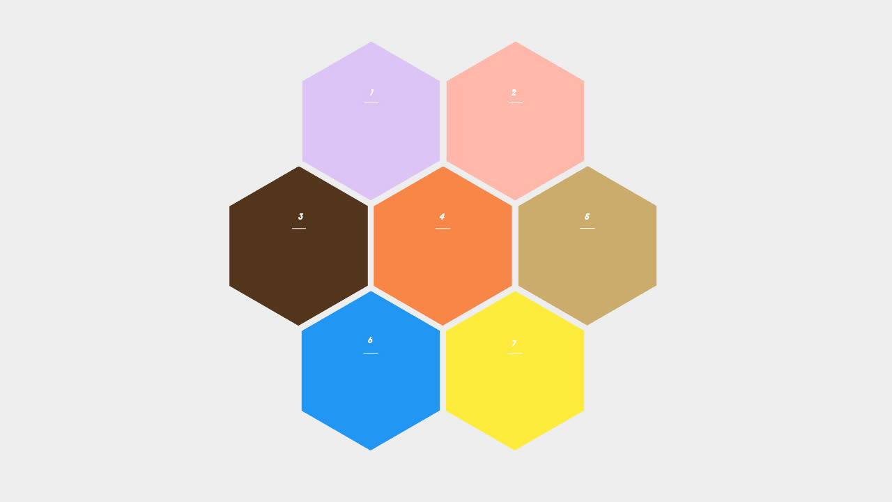
Rengga Dev – This time, I want to dive into another type of grid, one that works with shapes.
Like, what if the images aren’t perfectly square but instead are shaped like hexagons or rhombuses? Spoiler alert: we can do it. In fact, we’re going to combine CSS Grid techniques we’ve looked at and drop in some CSS clip-path and mask magic to create fancy grids of images for just about any shape you can imagine!
<div class="gallery">
  <img src="https://picsum.photos/id/1040/300/300" alt="a house on a mountain">
  <img src="https://picsum.photos/id/106/300/300" alt="sime pink flowers">
  <img src="https://picsum.photos/id/136/300/300" alt="big rocks with some trees">
  <img src="https://picsum.photos/id/1039/300/300" alt="a waterfall, a lot of tree and a great view from the sky">
  <img src="https://picsum.photos/id/110/300/300" alt="a cool landscape">
  <img src="https://picsum.photos/id/1047/300/300" alt="inside a town between two big buildings">
  <img src="https://picsum.photos/id/1057/300/300" alt="a great view of the sea above the mountain">
</div>
.gallery {
  --s: 130px; /* control the size */
  --g: 10px;  /* control the gap */
  display: grid;
  margin: calc(var(--s) + var(--g));
}

.gallery > img {
  grid-area: 1/1;
  width: var(--s);
  aspect-ratio: 0.866;
  object-fit: cover;
  clip-path: polygon(0% 25%,0% 75%,50% 100%,100% 75%,100% 25%,50% 0);
  transform: translate(var(--_x,0),var(--_y,0)) scale(var(--_t,1));
  cursor: pointer;
  filter: grayscale(80%);
  transition: .2s linear;
}
.gallery > img:hover {
  filter: grayscale(0);
  z-index: 1;
  --_t: 1.2;
}

.gallery > img:nth-child(1) {--_x: calc(-100% - var(--g))}
.gallery > img:nth-child(7) {--_x: calc( 100% + var(--g))}
.gallery > img:nth-child(3),
.gallery > img:nth-child(5) {--_y: calc(-75% - .87*var(--g))}
.gallery > img:nth-child(4),
.gallery > img:nth-child(6) {--_y: calc( 75% + .87*var(--g))}
.gallery > img:nth-child(3),
.gallery > img:nth-child(4) {--_x: calc(-50% - .5*var(--g))}
.gallery > img:nth-child(5),
.gallery > img:nth-child(6) {--_x: calc( 50% + .5*var(--g))}


body {
  margin: 0;
  min-height: 100vh;
  display: grid;
  place-content: center;
  background: #aabbfb;
}
If you check the code and compare it with the previous one you will notice that I have simply swapped the values inside clip-path and I switched between --x and --y. That’s all!


