Calendars, shopping carts, galleries, file explorers, and online libraries are some situations where selectable items are shown in grids (i.e. square lattices). You know, even those security checks that ask you to select all images with crosswalks or whatever.

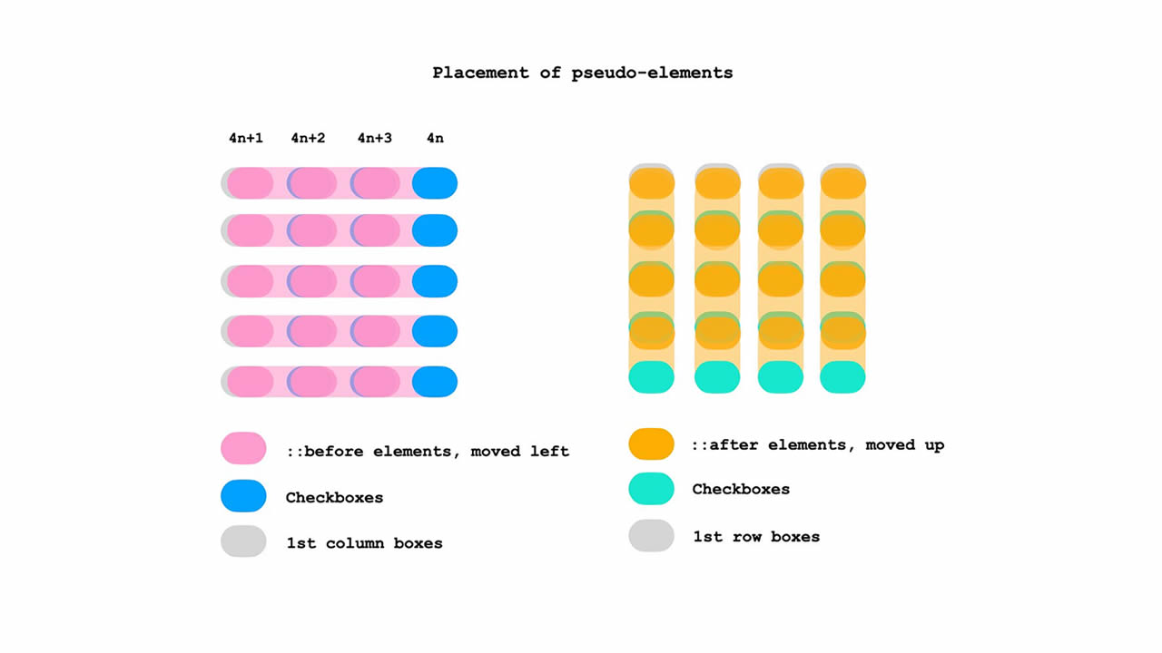
I found a neat way to display selectable options in a grid. No, not recreating that reCAPTCHA, but simply being able to select multiple items. And when two or more adjoining items are selected, we can use clever :nth-of-type combinators, pseudo elements, and the :checked pseudo-class to style them in a way where they look grouped together.
HTML
<h4>click or tap on any adjacent boxes</h4>
<main>
    <input type=checkbox>
    <input type=checkbox>
    <input type=checkbox>
    <input type=checkbox>
    <input type=checkbox>
    <input type=checkbox checked>
    <input type=checkbox checked>
    <input type=checkbox>
    <input type=checkbox>
    <input type=checkbox>
    <input type=checkbox>
    <input type=checkbox>
    <input type=checkbox>
    <input type=checkbox>
    <input type=checkbox>
    <input type=checkbox>
    <input type=checkbox>
    <input type=checkbox>
    <input type=checkbox>
    <input type=checkbox>
</main>
CSS
input {
    display: grid;
    width: 60px; height: 40px; margin: 0;
    appearance: none; -webkit-appearance: none;
    cursor: pointer;
    background: #ddd;
    border-radius: 20px;
}

input:not(:nth-of-type(4n+1))::before,
input:nth-of-type(n+5)::after {
    content: '';
    border-radius: 20px;
    pointer-events: none;
    grid-area: 1/1;
}

input:not(:nth-of-type(4n+1))::before { transform: translatex(-85px); }

input:nth-of-type(n+5)::after { transform: translatey(-60px); }

input:checked { background: limegreen; }

/* a checked box's right borders */
input:not(:nth-of-type(4n)):checked + input:checked::before {
    border-top-right-radius: 0;
    border-bottom-right-radius: 0;
    background: limegreen;
}
/* a checked box's bottom borders */
input:nth-last-of-type(n+5):checked + * + * + * + input:checked::after {
    border-bottom-right-radius: 0;
    border-bottom-left-radius: 0;
    background: limegreen;
}
/* a checked box's adjacent (rightside) checked box's left borders */
input:not(:nth-of-type(4n)):checked + input:checked + input::before {
    border-top-left-radius: 0;
    border-bottom-left-radius: 0;
    background: limegreen;
}
/* a checked box's adjacent (below) checked box's top borders */
input:not(:nth-of-type(4n)):checked + * + * + * +  input:checked + input::before {
    border-top-left-radius: 0;
    border-top-right-radius: 0;
    background: limegreen;
}
/* a checked box's (in last column) left borders */
input:nth-of-type(4n-1):checked + input:checked {
    border-top-left-radius: 0;
    border-bottom-left-radius: 0;
}
/* a checked box's (in last column) adjacent (below) checked box's top borders */
input:nth-of-type(4n):checked + * + * + * + input:checked {
    border-top-left-radius: 0;
    border-top-right-radius: 0;
}

main {
    display: grid;
    grid:  repeat(5, 60px) / repeat(4, 85px);
    align-items: center; justify-items: center;
    margin: 0;
}
h4 {
    font-family: courier new;
    margin:0;
    margin-bottom: 10px;
    color:  darkslategray;
}
body {
    display: grid;
    grid-template-rows: min-content min-content;
    margin-top: 25vh;
    align-items: center; justify-items: center;
    user-select: none; -webkit-user-select:  none;
    -webkit-tap-highlight-color: transparent;
}
Putting it to use
What we just looked at is the general principle and logic behind the design. Again, how useful it is in your application will depend on the grid design.
I used rounded borders, but you can try other shapes or even experiment with background effects (Temani has you covered for ideas). Now that you know how the formula works, the rest is totally up to your imagination.
Here’s an instance of how it might look in a simple calendar:
Again, this is merely a rough prototype using static markup. And, there would be lots and lots of accessibility considerations to consider in a calendar feature.
That’s a wrap! Pretty neat, right? I mean, there’s nothing exactly “new” about what’s happening. But it’s a good example of selecting things in CSS. If we have a handle on more advanced selecting techniques that use combinators and pseudos, then our styling powers can reach far beyond the styling one item — as we saw, we can conditionally style items based on the state of another element.


