Rengga Dev – Some Typography Blog Posts I’ve Bookmarked and Read Lately
- Font-size: An Unexpectedly Complex CSS Property — From Manish Goregaokar in 2017. Of many oddities, I found the one where
font: medium monospacerenders at 13px wherefont: medium sans-serifrenders at 16px particularly weird. - The good line-height — Since CSS supports unitless
line-height, you probably shouldn’t be setting a hard number anyway. - Time to Say Goodbye to Google Fonts — Simon Wicki doesn’t mean don’t use them, they mean self-host them. Browsers are starting to isolate cache on a per-domain basis so that old argument that you buy speed because “users probably already have it cached” doesn’t hold up. I expected to hear about stuff like having more control over font loading, but this is just about the cache.
- My Favorite Typefaces of 2020 — John Boardley’s picks for the past year. Have you seen these “color fonts”? They are so cool. Check out LiebeHeide, it looks like real pen-on-paper.
- How to avoid layout shifts caused by web fonts — We’ve got CLS (Cumulative Layout Shift) now and it’s such an important performance metric that will soon start affecting SEO. And because we have CSS control over font loading via
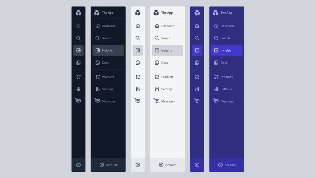
font-display, that means if we set things up such that font loading shifts the page, that’s bad. I like Simon Hearne’s suggestion that we tweak both our custom font and fallback font to match perfectly. I think perfect fallback fonts are one of the best CSS tricks. - How to pick a Typeface for User Interface and App Design? — Oliver Schöndorfer makes the case for “functional text” which is everything that isn’t body text (e.g. paragraphs of text) or display text (e.g. headers). “Clarity is key.”


