Rengga Dev – Creating page content that sticks to the viewport as you scroll, something like a jump-to-anchor menu or section headings, has never been easier. Throw a position: sticky into your CSS ruleset, set the directional offset (e.g. top: 0) and you’re ready to impress your teammates with minimal effort.
But sticky positioning can get a bit tricky, particularly when it comes to height and the dangerous situation of hiding content in a position that can’t be scrolled to. Let me set the stage and show you the problem and how I fixed it.
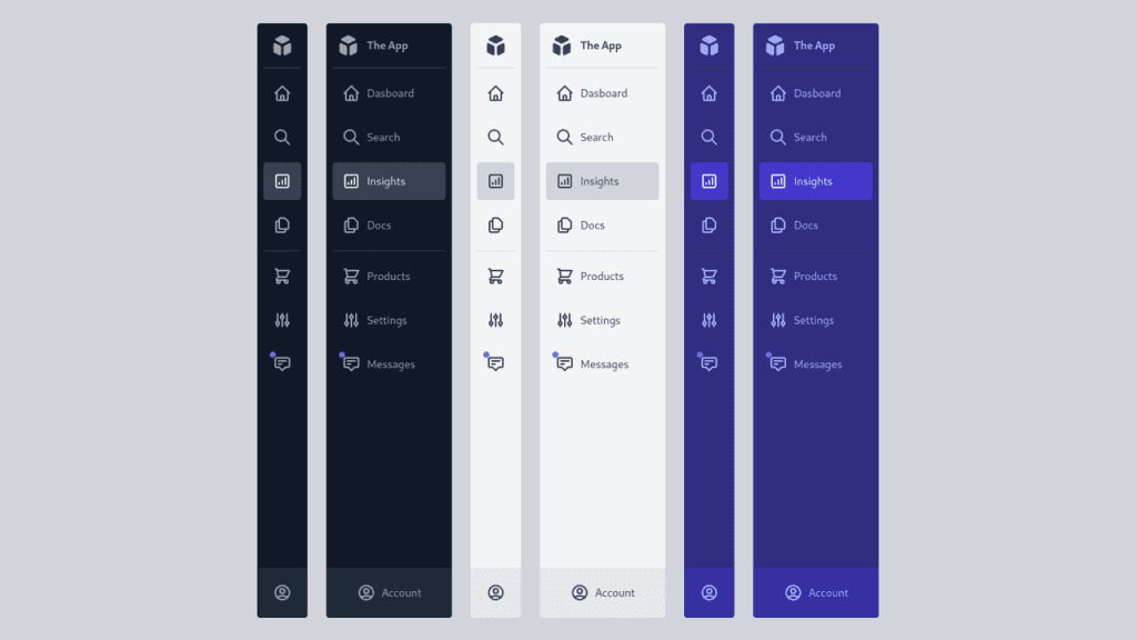
I recently worked on a desktop layout that we’re all familiar with: a main content area with a sidebar next to it. This particular sidebar contains action items and filters that are pertinent to the main content. As the page section is scrolled, this component remains fixed to the viewport and contextually accessible.
This layout may work well on a desktop browser, but isn’t entirely ideal for smaller devices or viewport widths. However, the code here provides a solid foundation that makes it easy to add improvements to the UI.
One simple idea: A button could be affixed to the viewport window that, when clicked, jumps the page down to the sidebar content. Another idea: The sidebar could be hidden off-screen and a toggle button could slide it in from the left or right. Iteration and user testing will help drive this experience in the right direction.


