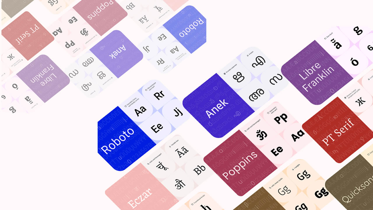
Finding attractive, user-friendly, legible fonts for your website isn’t always easy, but Google Fonts, launched in 2010, helps solve that problem. Having started small, the directory now includes more than 600 free, optimised fonts which can be added to your site just by embedding a snippet of code.
It’s a fantastic resource but, with so many fonts on offer, finding the ones you want to use, and pairing them up is a time-consuming process. With that in mind, here’s a list of the 30 best Google fonts.
Beautiful Google fonts for your website
1. The Droid family
Droid Sans, Droid Sans Mono, and Droid Serif are three great fonts that can be used as a replacement for Arial, Verdana, and Georgia. The Droid family was designed in 2006 with the sole purpose of providing web designers with a quality font that makes reading content on mobile devices comfortable.
![]()
2. Lobster
Lobster is a great choice for headings as it’s bold and beautiful while remaining readable, attributes not easily found in other fonts. It goes extremely well with Droid Sans as the body text.
3. Vollkorn
Vollkorn is meant to be a quiet, modest font that works well for everyday content. Boasting dark and beefy serifs this font looks great even at a small size. It comes in normal and bold and can be used as body type as well as for headlines and titles for print and web.
4. Bree Serif
Designed in 2008 by Veronika Burian and José Scaglion, Bree’s elegant appearance has led it to instant success. It’s a fun, upright italic serif font that can be used for headlines. It looks great when downsized and works well with when paired with Lato.
5. Cabin
Cabin is a clean and modern font that boasts eight styles: Regular, medium, semibold and bold, each with their corresponding italics. Its simplicity is its beauty giving it a personality of its own and making it an excellent type face for headings and body copy.
6. Lora
Lora is an elegant serif font that is available in four styles and looks great when used for body text. Its brushed curves give it a contemporary feel. It’s optimised for screen viewing but this font also works great in print and when paired with Istok Web.
7. Cookie
Cookie is based on brush calligraphy, reminiscent of 1950s ads and pin-up posters. Great for headings, this simple and legible font with its vintage appearance provides a sweet and decorative look to websites.
8. Playfair Display
Influenced by typeface designers John Baskerville and William Martin, Playfair Display is well suited for headings. With short capitals that are only marginally larger than their lowercase counterparts, Playfair Display looks terrific with Georgia for body text. It can be set with no leading if there is not a lot of space or for a stylistic effect in titles.
9. Montserrat
Created by Julieta Ulanovsky, Montserrat was inspired by old posters and signs in the Montserrat neighbourhood of Buenos Aires. This font boasts a set of alternative caps, which adds to the diversity of a very functional text typeface.
10. Ubuntu
The Ubuntu Font Family includes a series of sans serif fonts that focus on clarity and accessibility on mobile devices. It can be used for both headings and body text and it’s available in multiple languages.
11. Raleway
Raleway is a very charming thin font which has been expanded into a 9 weight family. It features old-style and lining numerals, as well as a stylistic alternate which looks great for thin headings.
12. Allerta
Created by Matt McInerney, Allerta is a moderately bold sans-serif typeface with charisma. It was designed so that it would be easy to read from afar with each character distinguishable from one another. It looks great on both headings and body copy.
13. Crimson Text
Inspired by the works of Jan Tschichold, Robert Slimbach and Jonathan Hoefler, Crimson Text is an old-style typeface with strong serifs designed to be used for everyday text.
14. Roboto
Roboto is great for body copy. This is the font used in Google’s Ice Cream Sandwich version of the Android operating system. It’s available in 12 weights and there’s even a Roboto Condensed version with six weights. It works well on magazine-style sites and personal blogs.
15. Rambla
Rambla is a somewhat condensed font for medium to long text which looks exquisite when enlarged. Another good option for body copy, this font would work well on websites when paired with Raleway.
16. Sanchez
Created by Daniel Hernandez, Sanchez is a serif typeface with a striking resemblance to Rockwell that works exceptionally well for headings. With Rounded edges this font offers a great contrast to the square structure.
17. Monda
Monda is a simple yet attractive font for body copy. It pairs well with a lot of fonts such as Offside and Ubuntu for headlines and it is extremely readable with its spaced out characters.
18. Offside
Eduardo Tunni’s Offside font features a simple structure and monoline strokes. It’s modern and slightly condensed look with large counters makes it a great font for headlines on the web.
19. ABeeZee
ABeeZee is a fun, friendly font that looks quirky but not to the point where it’s exaggerated. Designed to be used as a children’s learning font, it is extremely readable even when sized down. It goes well with almost any other font, and looks great when used in body copy.
20. Grand Hotel
Inspired by the 1937 movie “Cafe Metropole”, Grand Hotel is a condensed upright cursive font giving it a very classic look.
21. Domine
Domine is a traditional serif font with a taller x-height that makes it look crisp and easily legible at smaller sizes. Designed specifically for body text and optimised for the web this font combines elements from typefaces that have been around for more then 100 years.
22. Mouse Memoirs
Inspired by the iconic Micky Mouse, Mouse Memoirs is a fun font that plays with the baseline. Each letter has a different spacing from the previous one. This font would work best on websites with a younger target audience.
23. Nunito
Designed by Vernon Adams, Nunito is a sans serif font with rounded terminals and is available in 3 variants. This readable font looks great across all devices and is perfect for headings.
24. Dancing Script
Dancing Script is a casual yet elegant cursive script where the letters bounce and change size slightly with large caps that fall below the baseline. It works best for headings when you’re looking to give your site a friendlier more informal look.
25. Allan
Suited for headings, Allan is an eye-catching decorative typeface which comes in two variants and looks awesome when paired with the right body font.
26. Molengo
Molengo is a Latin typeface designed for documents that can give your site an old-school look. It can be used for both body and headings, it also comes with non-spacing mark placement.
27. Lekton
Created by a number of designers, Lekton was inspired by the typefaces used on Olivetti typewriters. The spacing for glyphs is modular, allowing better spacing between characters. Perfect for headings!
28. Nobile
Nobile is a modern font created with digital screens and handhelds in mind. The minimal styling is perfect for paragraphs as it’s legible at large and smaller sizes.
29. Goudy Bookletter 1911
Based on Frederic Goudy’s Kennerley Oldstyle, Goudy Bookletter 1911 can give your site an old style feel. It works well for body content, but be careful when combining it with other fonts as it can be tricky to find a good match.
30. News Cycle
Based on the revival of the 1908 font News Gothic, News Cycle is simple yet clear and legible even at a smaller size. The creator Nathen Willis, recommends using it for when you have large blocks of copy on your site.
Conclusion
Your turn now – Have you used any fonts from Google’s free web fonts directory? What are your favourite ones?


